When I began thinking about cover design for Paths of Alir, the third book in my award-winning epic fantasy series, A Pattern of Shadow & Light, I started looking through covers for similar fantasy books published in the last few years.
When I published Dagger of Adendigaeth in 2012, fantasy covers were still primarily showing work from commissioned graphic artists. In the intervening years, however, cover art has seen an evolution to more composite-based photographic art. One of the things I like about this style of cover is the ability to capture and represent a number of thematic elements from the book.
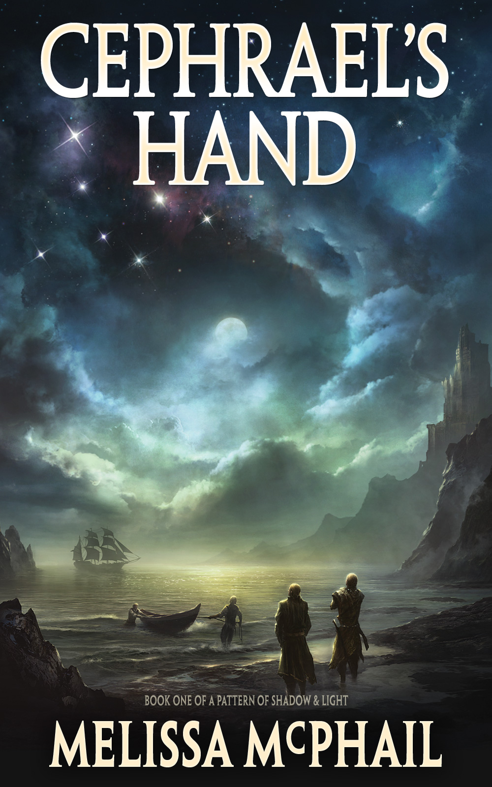
Cephrael’s Hand second edition cover
The previous cover for Cephrael’s Hand showed an important scene from early in the novel, when Prince Ean val Lorian was first returning to his father’s kingdom of Dannym. Eerie moonlight on a deserted beach set the proper tone of the story, while also capturing the important constellation that was the novel’s namesake. I commissioned the cover art from Kentaro Kanamoto, and I still love the work—enough that I hesitated when considering rebranding the series.
Kentaro also did the cover art for the second book, The Dagger of Adendiageth. It was beautiful and otherworldly in its representation of the realm of T’khendar, but I didn’t think it was a strong enough cover to attract interest in its own right, and the two books had no real continuity. You couldn’t tell they were part of the same series.
I felt it important for the book covers in the series to seem connected, to have a branded look—especially since we will likely end up with five books overall. Looking ahead, I wanted to establish some central themes that could be carried forward from book cover to book cover—fonts, colors, similar stylistic images that would come to pictorially represent the series in my readers’ minds. So I set out to find a new cover artist that could help me bring this vision into being.
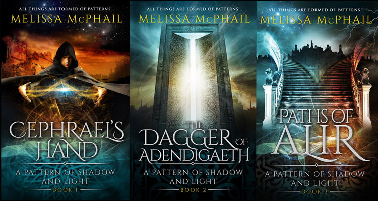
Going through the process of reimagining my book covers was a learning experience. I found out quickly that using a composite style of layered images allows the artist to capture more thematic elements from the book. I worked with a single cover artist from Damonza.com for these new covers. I’m thrilled that each one captures key themes from its respective book.
For example, on the new cover for Cephrael’s Hand, the namesake constellation peering above fiery heavens gives the feeling of menace and threat that hounds Ean throughout the story. The Extian Doors on the cover of The Dagger of Adendigaeth represent the entire concept of rebirth and restoration that is the novel’s central theme. And for Paths of Alir, the divergent staircases lead towards light and dark while the stars of Cephrael’s Hand look down with typical indifference.
Overall, I think the new covers well represent each individual novel, while binding the series amid constant, recurring themes. As with any artistic endeavor, beauty is in the eye of the beholder, but I love these new covers, and I hope you will as well.
The cover for Cephrael’s Hand is currently on tour. Maybe you’ll see it featured on one of your favorite book blogger sites!
If you have opinions on the new covers, please share your thoughts in the comments below. I welcome your feedback.
I love them! They’re more visually engaging for sure. (I just spent a few minutes ogling them!) 🙂
Thanks, Melissa. I’m thrilled to know you approve.
I really liked the previous covers, but I LOVE these new ones. They are more engaging and capture the key thematic elements of each book, plus the series as a whole. Congratulations, Melissa, on finding a single cover artist. Looking forward to the new release in October!
Thank you so much, Raina. Considering how well you know the story and characters, having your stamp of approval means a lot.
I LOVE the new covers!!! I’m currently reading (and enjoying!) “Cephrael’s Hand”, and will be reviewing it on Sept. 8th, with Novel Publicity Book Tours. Somehow, I missed the cover reveal tour. However, I do have a cover meme on my blog, titled “Shelf Candy Saturday”, so I’d like to feature the new cover of “Cephrael’s Hand” on it, either this Saturday, or the next. Could you give me the name of the cover artist so I can mention him or her in my post? Thanks!! : )
Here’s the link to a recent SCS post, so you can get an idea of the sort of thing it is:
http://anightsdreamofbooks.blogspot.com/2014/08/shelf-candy-saturday-123-metamorphoses.html
This is a really helpful post. I’m preparing to indie publish a six book series, and amazing cover art is a high priority. Your new covers have glowing special effects, and the text looks more integrated and natural as part of the design. I think those are some key differences.
I’m so glad you found the post helpful, Abby. The new covers have made a huge difference in sales for me, so you’re smart to make cover art a priority. Good luck with your upcoming series! Tweet me when it’s released. 🙂