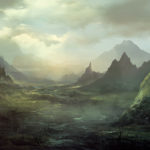
I’ve been working with an artist on the cover for book 2, The Dagger of Adendigaeth, as we creep ever closer to publication. For this book cover, I asked Kentaro Kanamoto to paint on his virtual canvas what I’ve been envisioning in the universe of my own mind for so long. He’s returned some incredible images that I thought I’d share (mainly because they are so beautifully done, even in rough form) but also by way of illustrating my recent thoughts on book covers, generally.
Nearly every writer’s blog out there has something to say about the importance of your book cover. They tell you people do judge a book by its cover; they list the top ten things your book cover must do and say and not do or say. They explain the importance of grabbing a person’s short attention span for the three seconds they’re scanning your cover–oh, it’s an exhaustive list of reasons to have your book covers professionally done–and it’s all excellent advice and well worth reading.
What interests me most about book covers is something more visceral. Books have a “feel” to them. The author’s voice plays a role in establishing that feeling in the same way a band establishes its own trademark sound. But it’s not just the author’s writing style that engenders this feeling—it’s very much in the story itself. You can describe a book as dark or comedic, etc, but the feeling of a story cannot really be described. It has to be experienced through taking the journey as a reader. Your book cover then, if done well, not only sells the book but also captures something of that essence of the story. It helps to establish that “feel” and sets the theme (if not the scene) for the story overall.

Kay Kenyon’s Bright of the Sky is a great example of this. I certainly landed on the book for all the reasons noted by those aforementioned experts. The cover was intriguing, but it was also beautifully done. The artistry of it conveyed a strong sense and feel of this unique story. And here’s where we come to my point.
The slightly Oriental influences in the cover art are described in the story itself; yet looking back, I would not have nearly the same feeling or impression of this series if not for the design of this cover. I cannot actually separate the series from its covers anymore (all of the covers in her series are spectacular). The cover made an indelible impression and laid a foundation upon which the rest of the story unfolded. As the series grew, my vision of Kenyon’s world expanded, but it was always framed by that first cover image. This is a cover well done.
Conversely, and I’m sure to gain no friends by speaking anything ill of the illustrious Pat Rothfuss, but take a look at the cover for The Name of the Wind. If you’ve read this immaculate work of fiction, you’ll know there is a plethora of greatness to appreciate in it. His writing is formidably fabulous, his character Kvothe both compelling and tragically broken. The story is mysterious and adventurous and fantastical in the truest sense of the words. If ever there was a storyteller who didn’t need a great cover to sell his work, Mr. Rothfuss would be the one.
 Yet the cover is compelling in its own right. It’s got the ever-important-in-fantasy-these-days cloaked and hooded character on the front. It conveys a sense of mystery and loneliness. But I don’t feel it captured the essence of the story. Maybe it didn’t need to—the mastery of Rothfuss’ Prologue sets the scene and an incredible bar for others to emulate. The cover is intriguing enough to grab your attention; Pat’s writing sells the rest. Tor could’ve commissioned a cover as uninteresting as GRRM’s Game of Thrones and this book would still have sold millions.
Perhaps the publisher found themselves in a situation where trying to capture the essence of this story, which is as mercurial as Kvothe himself, was a bite more than any artist could chew. So they went with a simple cover, but not a great one. If your yardstick to greatness is how many books are sold, Tor has no regrets. But my point isn’t marketing, it’s artistry. The artistry of capturing and conveying a sense of the universe of the author on a canvas (generally speaking) 1040 x 680. That’s a tall order for any artist, and it’s why I think the covers that truly capture a story’s essence are laudable for that excellence—both on the part of the artist and the author/publisher who collaborated with them.
With this in mind, I’m thrilled with Kentaro’s work so far on the cover for The Dagger of Adendigaeth. I can tell he is well on the way to capturing the essence of my novel via color and design. To be able to swirl together shapes, light and shadows and channel an entire universe into existence in the process is one of the most amazing talents in this world. Writers do it with words, artists with light, yet both are, in their own sense, magical.
Here are Kentaro’s images. I’ll keep to myself what location he is capturing, but feel free to hazard your own guesses. These are still rough sketches, and only one of them will become the final painting, but I think you’ll see some of the essence of A Pattern of Shadow & Light already portrayed within them. They give an idea of what is to come, even as each book in my series ends with the promise of new possibility.


I also believe a startling cover is essential, especially for Indie writers. A well-designed cover reassures the reader that the author took similar care crafting their story.
I have also heard it said that the more fantastical a story, the more realistic style needed for the cover art. I tend to agree with this, as it makes the story elements more concrete in the reader’s mind. I would argue that since the fantasy genre is made powerful by its imaginative visuals, a good cover is doubly important.
I look forward to seeing the full illustration for The Dagger of Adendigaeth, as it promises a wide world of wonder.
I totally agree. We could probably collaborate on a nearly endless list of reasons a good cover is important, and you’ve given another great one for indie authors specifically.
I like the inverse concept you noted of fantastical story/realistic cover. There needs to be a balance between the concepts presented to a reader which he is meant to contribute to with his own imagination and those which are given in stark CMYK. Finding that balance is one of the many challenges of an artist/author relationship, and one that talented artists seem to take in stride.
Thanks for the comment on my upcoming cover – I couldn’t be happier with Kentaro’s vision of my world so far.